Select a Control node
Select a Control, Button, Label, Slider, ProgressBar, TabContainer, Window, or another supported UI node.
14 UI-specific actuator bricks detected in the addon.
UI actuators work with Control-based interfaces and are listed in the same flat menu structure used by the addon.
Use this section for Control-based interfaces. Unlike the longer 3D and 2D lists, the addon intentionally displays compatible UI actuators as one flat menu.
Select a Control, Button, Label, Slider, ProgressBar, TabContainer, Window, or another supported UI node.
The addon keeps sensors and controllers available, but filters actuators to the UI-compatible set.
Many UI actuators can act on the selected node or locate another interface node by name, depending on the brick.
Connect input or UI sensors to controllers and then to focus, text, visibility, popup, slider, tab, window, or other UI actions.
The UI actuator menu is flat by design, so this page uses one linked actuator reference rather than artificial submenus.
These entries appear directly under Actuators when a supported UI node is selected.
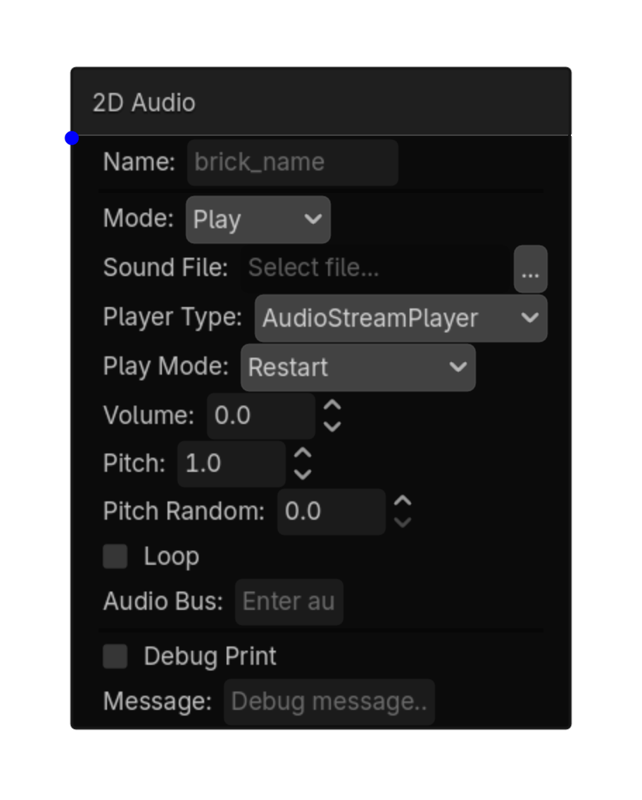
Plays UI or 2D audio.
| Property | Details |
|---|---|
mode
|
Mode
Choices: Play,Stop,Pause,Fade In,Fade Out Default:
play
|
sound_file
|
Sound File
Choices: *.wav,*.ogg,*.mp3 |
player_type
|
Player Type
Choices: AudioStreamPlayer,AudioStreamPlayer2D Default:
stream_player
|
play_mode
|
Play Mode
Choices: Restart,Overlap,Ignore If Playing Default:
restart
|
volume
|
Volume
Choices: -80,24,0.1 Default:
0.0
|
pitch
|
Pitch
Choices: 0.01,4.0,0.01 Default:
1.0
|
pitch_random
|
Pitch Random
Choices: 0.0,1.0,0.01 Default:
0.0
|
loop
|
Loop
Default:
false
|
audio_bus
|
Audio Bus |
fade_duration
|
Fade Duration
Choices: 0.1,10.0,0.1 Default:
1.0
|
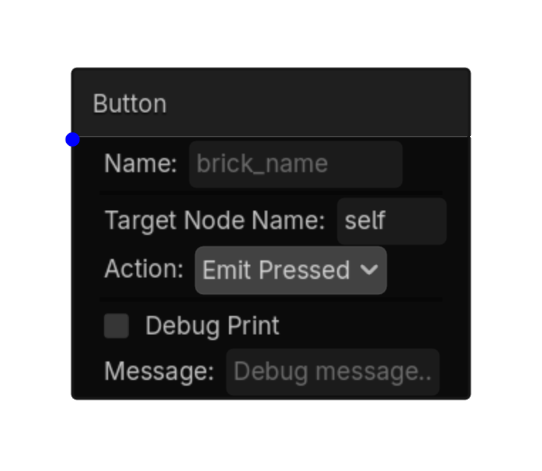
Triggers, toggles, presses, or releases a Button node.
| Property | Details |
|---|---|
target_node_name
|
Target Node Name
Default:
self
self or Button node name |
action
|
Action
Choices: Emit Pressed,Press,Release,Toggle Default:
emit_pressed
|
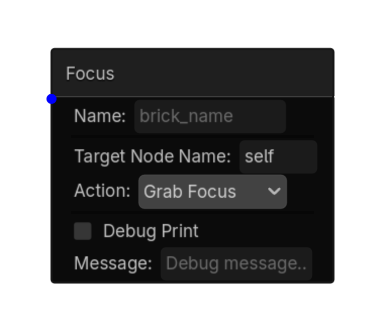
Grabs or releases keyboard/gamepad focus on a Control node.
| Property | Details |
|---|---|
target_node_name
|
Target Node Name
Default:
self
self or Control node name |
action
|
Action
Choices: Grab Focus,Release Focus Default:
grab_focus
|
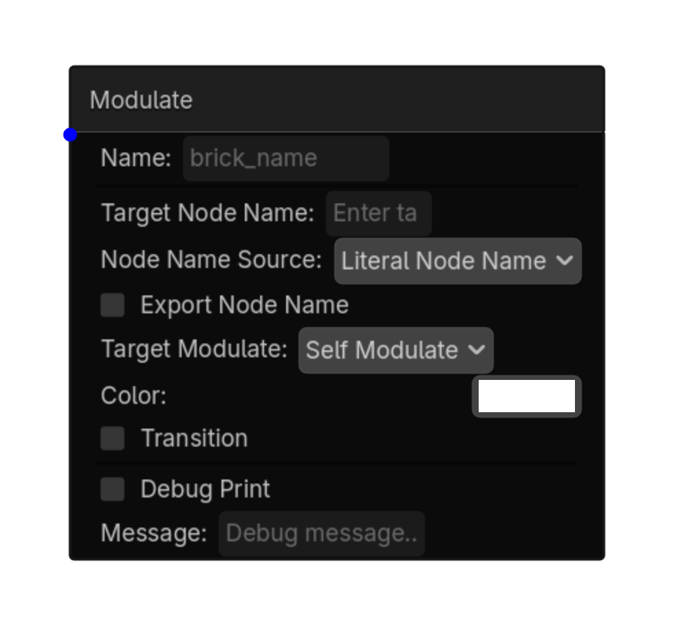
Sets or transitions color/alpha on a Control or CanvasItem node.
| Property | Details |
|---|---|
target_node_name
|
Target Node Name |
node_name_source
|
Node Name Source
Choices: Literal Node Name,String Variable Default:
literal
|
export_node_name
|
Export Node Name
Default:
false
|
target_modulate
|
Target Modulate
Choices: Self Modulate,Modulate Default:
self_modulate
|
color
|
Color
Default:
Color(1
|
transition
|
Transition
Default:
false
|
transition_speed
|
Transition Speed
Default:
5.0
|
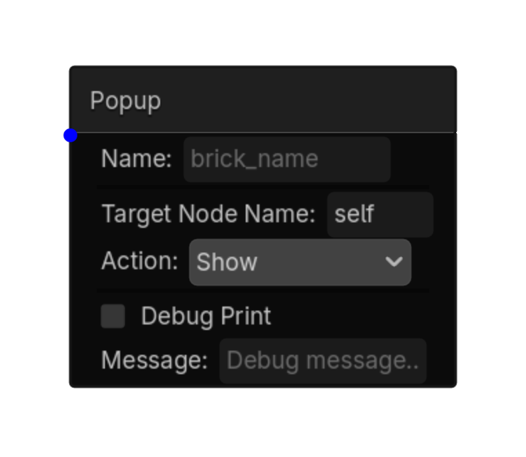
Shows, hides, toggles, or centers a Popup/Window-like UI node.
| Property | Details |
|---|---|
target_node_name
|
Target Node Name
Default:
self
Popup node name |
action
|
Action
Choices: Show,Hide,Toggle,Popup Centered Default:
show
|
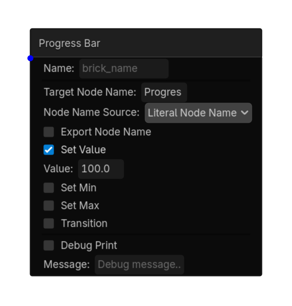
Sets the value, min, or max of a ProgressBar, Slider, or Range UI node.
| Property | Details |
|---|---|
target_node_name
|
Target Node Name
Default:
ProgressBar
|
node_name_source
|
Node Name Source
Choices: Literal Node Name,String Variable Default:
literal
|
export_node_name
|
Export Node Name
Default:
false
|
set_value
|
Set Value
Default:
true
|
value
|
Value
Default:
100.0
|
set_min
|
Set Min
Default:
false
|
min_value
|
Min Value
Default:
0.0
|
set_max
|
Set Max
Default:
false
|
max_value
|
Max Value
Default:
100.0
|
transition
|
Transition
Default:
false
|
transition_speed
|
Transition Speed
Default:
5.0
|
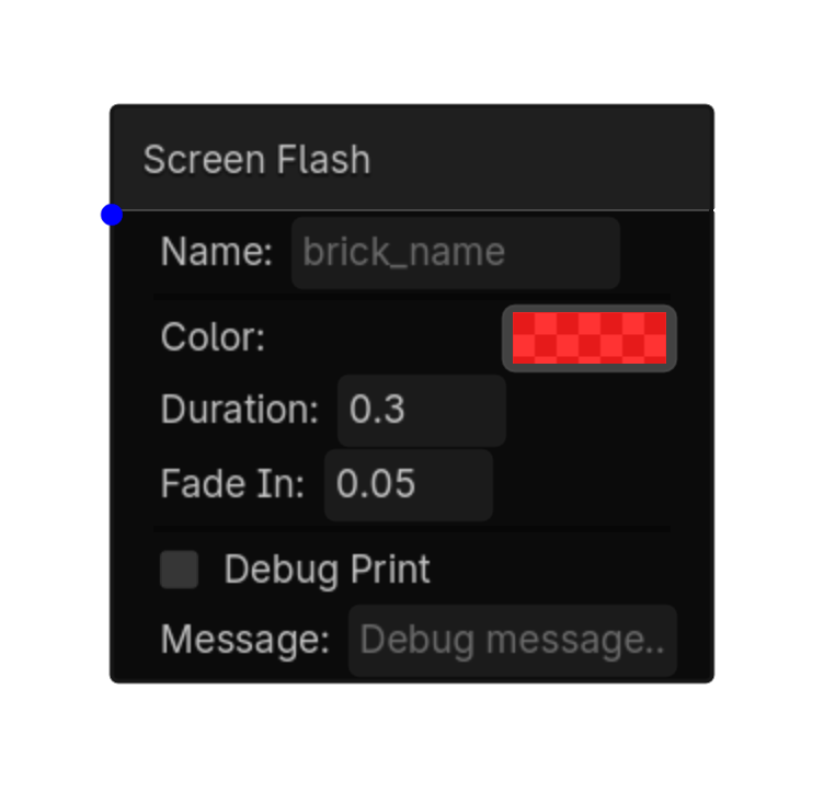
Flashes a full-screen ColorRect overlay.
| Property | Details |
|---|---|
color
|
Color
Default:
Color(1
|
duration
|
Duration
Default:
0.3
|
fade_in
|
Fade In
Default:
0.05
|
Sets or adds to a ScrollContainer scroll position.
| Property | Details |
|---|---|
target_node_name
|
Target Node Name
Default:
self
ScrollContainer node name |
mode
|
Mode
Choices: Set,Add Default:
set
|
axis
|
Axis
Choices: Vertical,Horizontal,Both Default:
vertical
|
x
|
X
Default:
0
|
y
|
Y
Default:
0
|
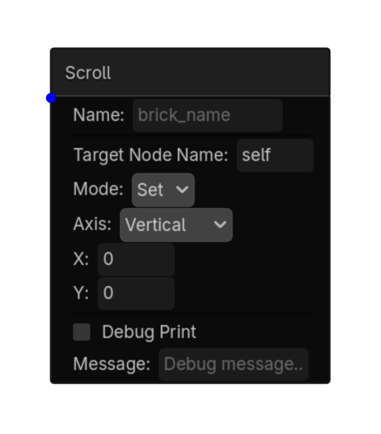
Sets or adds to a Slider or Range value.
| Property | Details |
|---|---|
target_node_name
|
Target Node Name
Default:
self
Slider node name |
mode
|
Mode
Choices: Set,Add Default:
set
|
value
|
Value
Default:
0.0
|
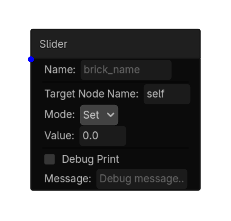
Changes the active tab on a TabContainer.
| Property | Details |
|---|---|
target_node_name
|
Target Node Name
Default:
self
TabContainer node name |
action
|
Action
Choices: Set,Next,Previous Default:
set
|
tab_index
|
Tab Index
Default:
0
|
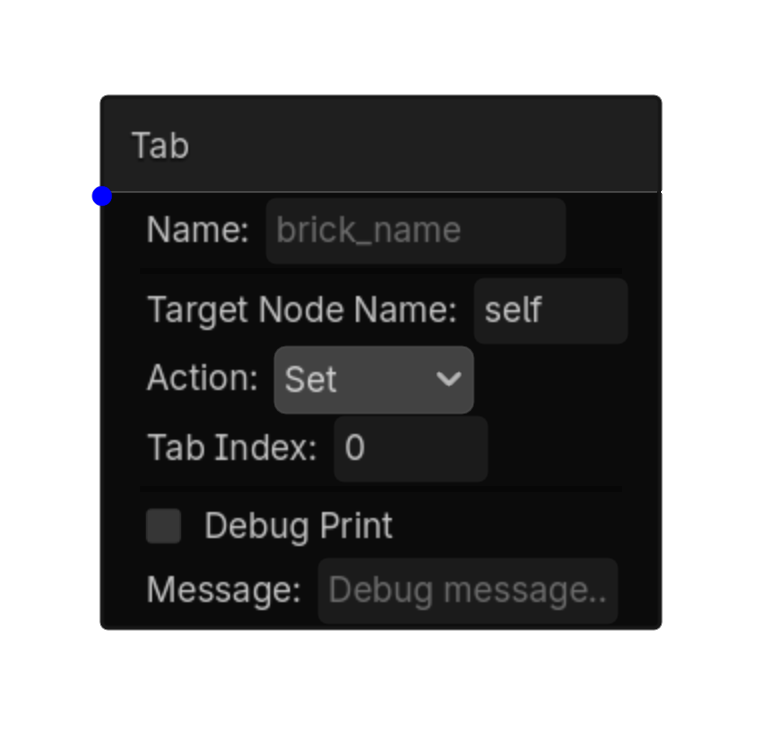
Updates a Label, RichTextLabel, or other text UI node.
| Property | Details |
|---|---|
target_node_name
|
Target Node Name
Default:
Label
|
node_name_source
|
Node Name Source
Choices: Literal Node Name,String Variable Default:
literal
|
export_node_name
|
Export Node Name
Default:
false
|
mode
|
Mode
Choices: Variable,Static Default:
variable
|
variable_name
|
Variable Name |
prefix
|
Prefix |
suffix
|
Suffix |
static_text
|
Static Text |
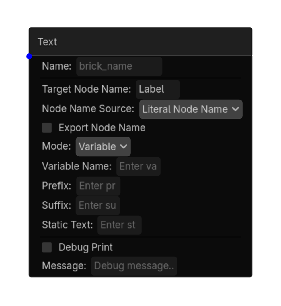
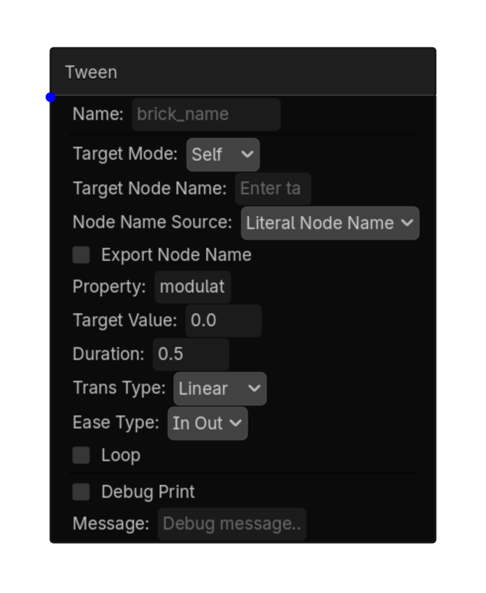
Tweens a UI node property.
| Property | Details |
|---|---|
target_mode
|
Target Mode
Choices: Self,Node Default:
self
|
target_node_name
|
Target Node Name |
node_name_source
|
Node Name Source
Choices: Literal Node Name,String Variable Default:
literal
|
export_node_name
|
Export Node Name
Default:
false
|
property
|
Property
Default:
modulate:a
|
target_value
|
Target Value
Default:
0.0
|
duration
|
Duration
Default:
0.5
|
trans_type
|
Trans Type
Choices: Linear,Sine,Quint,Quart,Quad,Expo,Elastic,Bounce,Back,Spring,Circular,Cubic Default:
linear
|
ease_type
|
Ease Type
Choices: In,Out,In Out,Out In Default:
in_out
|
loop
|
Loop
Default:
false
|
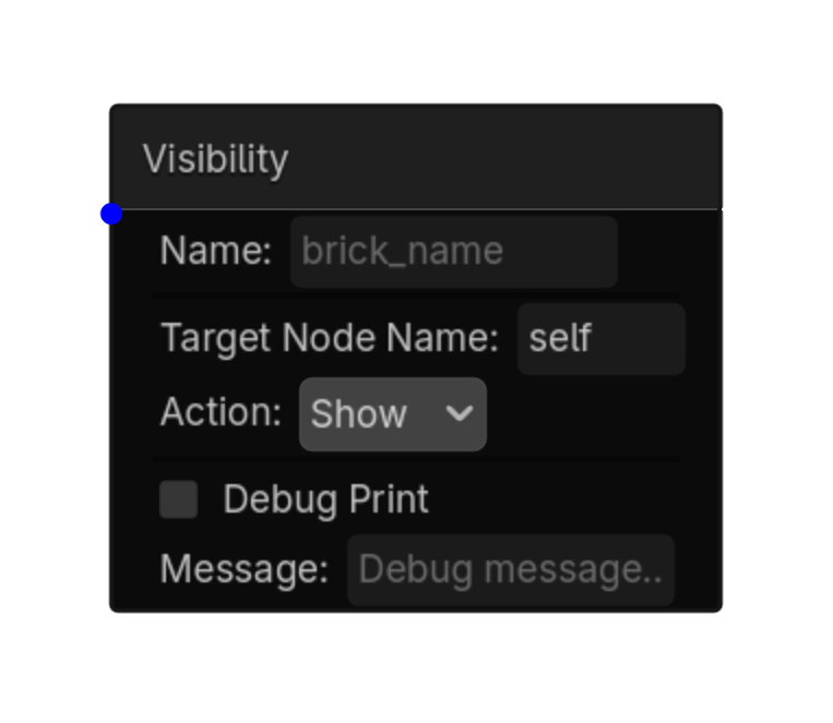
Shows, hides, or toggles a UI node.
| Property | Details |
|---|---|
target_node_name
|
Target Node Name
Default:
self
Node name |
action
|
Action
Choices: Show,Hide,Toggle Default:
show
|
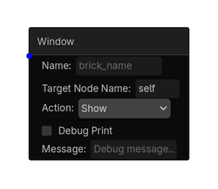
Shows, hides, toggles, or centers a Window node.
| Property | Details |
|---|---|
target_node_name
|
Target Node Name
Default:
self
Window node name |
action
|
Action
Choices: Show,Hide,Toggle,Popup Centered Default:
show
|